« Notes [post discussion with Denise] | Main | Elvis Monster '?' ill cap »
August 08, 2004
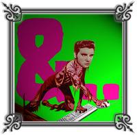
Elvis-monster: '&' ill cap
". . . with the momentum of a flood in a museum, strange creatures appeared: Elvis Christ, Elvis Nixon, Elvis Hitler, Elvis Mishima, Elvis as godhead, Elvis inhabiting the bodies of serial killers, of saints, fiends. Each was a joke, of course; beneath each joke was bedrock, obsession, delight, fear." [Greil Marcus' intro to 'Dead Elvis']
This is the outcome of a few different things I've been trying this week. I've been looking at Elliot Earls work quite a bit following Denise's advice, and it's influenced this a lot . . .
Initially looking at Earls' work I really hated it ˝ that was about 5 years ago I guess when I first saw it in Emigre . . . and I hadn't thought about it since. Until Denise mentioned it. Actually when she mentioned it I thought 'Oh my god, she doesn't get me at all' . . . but I went and looked at his stuff (via his site http://www.theapolloprogram.com/, and also an article in Eye #45 by Rick Poyner) and I can totally see why she directed me to him now. He makes Country music! He makes monsters too. He's developed some weird fucked up visual language that appears to be a hybrid of multiple sources ˝ of course he NEEDS to make his own typefaces for this 'voice' to operate. The "referential density" [Poyner] in his work really appeals to me . . . as does his use of ". . . multifocal complexity to provoke a vertiginous sense of displacement. He wants to make the strange familiar and the familiar strange" [Poyner again]. I like that his work appears to evolve out of some sort of identity crises . . . a common theme in hybrid monsters like werewolves!
Also, see his Elvis piece at http://www.emigre.com/FF/ELB15.GIF
In regard to my image here . . .
I have, for now, ditched the need to render these as b/w vector art. I've been looking at Earls work in an effort to 'push forms harder' [Denise] . . . his work certainly pushes me outside my [formal] comfort zone. The image I'm including here is very different to anything I've ever done before . . . I'm enjoying trying to make ugly work. Actually, I'm not sure if it is 'ugly', or 'icky' [see Lisa's comment on previous post] . . . how do you tell in your own work?
There are multiple appropriations here [sources, references?] . . . the comic book monster figure, Elvis, B-grade horror letterform [House Industries], Punk [the way punk posters used cut-and-paste/collage to create hybrid images . . . also originally I had the pink letterform on a yellow background, referencing Reid's cover art for 'Never Mind The Bollocks' ˝ maybe I should have left it yellow?], and then the frame is obviously taken from the illustrated capitals I've been looking at, an effort to plant the work back into that genre. I'm calling this an 'ill cap' because I like the link to sickness, to monsters [and also the contemporary use of the word as an affirmation]. On top of all this there's the [what I would call] gratuitous use of photoshop filters which I'm using in an effort to render some kind of contemporary kitsch [rather than being purely nostalgic]˝ this comes from the magazines I was looking at in my book 'Hot Rod Biology' . . . I wish I'd known about these filters then!? [see I told you this was new for me]
So I guess I'm wondering now . . . is this a 'Hybrid Statement'? Is this "referential density"? Is that the same thing? Does this monster reveal anything? Can the Hybrid Practitioner be like Dr Frankenstein [appropriating dead 'parts' to create new, living 'wholes']?
Posted by Luke Wood at August 8, 2004 11:18 AM
