« Friday | Main | Reflection »
July 04, 2005
Saturday
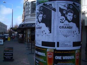
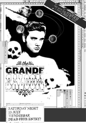
Elvis finally showed up. Along with a real life 'error' ó the window with the band motto "with our reverb . . ." corrupted when I output it from Freehand as a .jpg file. I put this one up on Saturday morning. This is the LAST poster . . . 'finished' supposedly?
I want to reflect on this project this week (via this blog). I had a good discussion with Laurene half way through, and I have a lot to think about esp. in terms of where to go with things now . . . the possibility of doing this again based on what I learnt this time is appealing.
Posted by Luke Wood at July 4, 2005 08:43 AM
Comments
I didnt really like this (the general aesthetic of the poster) when you first started (although i really like the idea).
I think I'm surrounded by way too much 'clean' "design"....
The final version of the poster has grown on me, im actually starting to like it more. Im trying to think why....i think its a visual thing (im liking the not so busy bottom of the poster). I think the size helps alot too (and seeing it in its actual context on the piller)...actually the more i look at it, i think it kicks ass......good to see something pushing.
How was the gig??
Posted by: Duncan at July 5, 2005 10:24 AM
actually what i said about it growing on me as a visual thing i take back....i mean yeah thats part of it, but i went for a walk at lunch, and looked at some other back & white band posters, some of the cheaper "homemade" ones at a quick glance seem similar (no colour, thin cheap paper, that "cut-up" look with randomly placed type and image), so i think the difference could be the thoughtfulness of the work. the work has alot more meaning (which obviously makes it stronger), but is this because i know more about it than say a random viewer would?
anyway, its the concept that has become more appealing to me now.
I'm liking how Gysin has become Elvis, I actually find that humorous...ha!
Posted by: Duncan at July 5, 2005 12:37 PM
Thanks for taking notice Duncan . . . critique is very much appreciated! That really interests me that you don't really like the aesthetic direction this poster has taken . . . let me explain ó my background in design has been a very 'clean', Modernist, academic one (I used to design artist catalogues and other 'hi-end' print projects). In many ways my research is all about me trying to escape this. My practices in design and music have always been distinctly separate in this sense . . . I never took music so seriously!
My interest in monstrosity is essentially about trying to find value in the 'bad', in failure, in getting things wrong. Of course this is hugely problematic . . . but . . . I think I'm trying to get away from the safety of just always doing what I know worksótaking some risks I guess.
What I thought was interesting about your initial comment was that 'I' thought I had 'over-designed' these ó in this sense I see them as being TOO RESOLVED. So it's interesting to get a more objective viewpoint on them. It's a pity you didn't get to see the real thing . . . you live in Wellington?
I think you're definitely going to get a lot more out of these if you know stuff about the references in the images, the connections are supposed to leave open questions . . . the relationship between Elvis and Gysin for instance . . . speculation. Glad you liked that. Humour is important in The Grand Saloon, and more and more in my design practice too . . . which I guess is indicative that perhaps I'm learning not to take myself so seriously!?
The gig's not until 23 July, about three weeks away. The plan was to show the process of desiging this poster this week, let them get covered up, and then put up the final poster around town again the week before the gig.
Posted by: Luke Wood at July 5, 2005 05:37 PM
Hey Luke
sorry i took so long to reply, man been a busy past week.
Yeah i know what you are saying about 'clean'design, as am doing that sort of thing...i guess what i was saying was that i didnt like the poster when i first viewed it...i thought some of the type looked..hmm cheap? (im not a fan of that beveled raised type...the 'photoshop' look?? ha) Although i did really like the first poster being still inside photoshop (i thought it would slowly creep out of it into another role, like more into the realm of a poster, rather than stay in a design program), i guess it says something about how you work/about the work being involved with the computer.
But what i was trying to say is that i really like it now... and i was trying to figure out why. A thought i had was that i am too surrounded by clean design and that changes my view (yeah i live in wellington, so im surrounded by "clean cut" 'not so meaningful' massey design.....) its a pretty scary thought that i have been affected so soon after finshing Uni (i was lucky enough to study conceptual design at an art school).
Being surrounded by bad design )or ('good' design)for a couple of years is enough to do that i guess..even if i am aware of it. So anyway i think thats why i didnt really dig the poster at first....but i think it has had a good affect on me and made me see design a little different over the past week (which is a good thing right?)
Of course if i did anything like that at the agency i work for they would laugh (or cry).
This is why we prob need our personal work (which yours obviously is) as I think I can only be an industry whore for so long. which you can only do for so long i guess.
What i do find interesting is that im in a wellington band, and do the design as well...the other guys in the band are always wanting more of the name and branding so people will remember you and come to your gigs. Of course this is hard to do as my taste in design changes and grows (hopefully) and you end up hating what you did a year ago. i think this is why im appreciating the more experimental design rather than playing it safe.
One thing i like about Sagmeister, while he does all this great amazing good looking design, he doesnt seem to be afraid of making ugly work, which i am wanting to explore my self. (the stuff you dont see so much of).
I liked the Gysin element, but no im not aware of the elvis connection, (im trying to do a search now)...the elvis of letters?? (burroughs) hmmm ill have to look into it...
I havent had time to look around your website and really get a grasp of what your doing...so i made those comments blind. i will try to amend that.
Duncan
Posted by: Duncan at July 12, 2005 08:17 AM
Really good to hear that you've 'come around' to the image. I'm really interested in the idea that you can present kind of monstrous images (familiar/unfamiliar) that are immediately uncomfortable but that engage the audience. I'm interested in monster movies where you often end up on the side of the monster.
Yeah that's interesting that you say you're wanting to explore making ugly work. I'm trying to explore this too . . . but find it very hard!? I wonder if Sagmeister 'tries' to make ugly work? Do you have a reference to this? I know he included a lot of projects he hated in his book "Made you look", but I kinda got the impression he blamed this on clients. Have you read "The Cult of The Ugly" by Steven Heller . . . actually I should re-read this. I think you can get it off the web somewhere, maybe typotheque.com?
Posted by: Luke Wood at July 14, 2005 04:59 PM