« Hybrid statements | Main | Johnny Rotten visited by Elvis' Ghost »
June 30, 2004
Trials for Elvis font
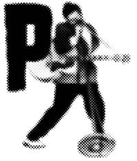
I've spent about a week now trying out different styles and approaches for this Elvis font. Initially they were looking too kitsch and 50s [below], and they weren't really presenting anything 'hybrid' ˝ nothing you wouldn't expect to see Elvis looking like (although I do like the dot/screen reference to pop culture and might come back to this) . . .
so I thought I'd try inserting Elvis directly into the medieval examples that I was talking about originally . . .
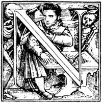
I feel much happier with the direction this might take. Especially with the kinds of events I'm planning on using ˝ the play between good and evil ˝ skeletons could be good too . . . Elvis's dead twin brother for instance.
These are only trials and I'm thinking it could take a while to settle on a particular stylistic approach, so I'll be posting them here as they develop. I do intend for this to be a font, so I'll have to test how complicated the outlines can be ˝ does anyone out there know anything about this?
Posted by Luke Wood at June 30, 2004 02:51 PM