« September 2004 | Main | November 2004 »
October 27, 2004
Seminar No.2
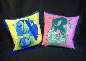
This 'download file' is a PDF of the talk I gave on my research to date and where it might be going from here. In it I attempt to pinpoint the more generative aspects of the work I've been making during the second half of this year. I introduce my interest in the notions of monstrosity and the grotesque, and do my best to unravel my struggle with the importance of content or form in my work. I also discuss my relative dissapointment with the cushions pictured above.
The extended entry here roughly outlines the feedback from the review panel (words in caps are terms I want to revisit) . . .
J A S O N :
> Identified HUMOUR as strength in my work ń but that I don't discuss this at all.
[I honestly had never seen this as being humourous, but I certainly don't mind that it might be . . . one thing I really liked about Tom Kreislers practice was that he never took himself or his work too seriously, and I think irreverence can be dangerous without a sense of humour]
> States that he finds the earlier pieces showing Elvis 'as' a monster more interesting . . . perhaps because they're UNEXPECTED.
> Finds later work becoming too REFINED . . . doesn't look as EXPLORATORY.
> Enjoyed the aspects of the work that didn't make sense . . . maybe more GENERATIVE when it doesn't make sense?
[I like this, but am still trying to unpack what it might mean for me. I guess I'm always trying to make sense of things and maybe if I wasn't I'd be able to EXPLORE more?]
> finds the creation of an 'alternative history' (in relation to 'Lipstick Traces') an interesting part of the later works.
S T E P H E N:
> States that the "House Industries" style is very loaded . . . too nostalgic, too retro. Working in this pop aesthetic is just PASTICHE. Asks what have I got to bring, or add to this?
[in answer to this I restate the research question, as this is essentially the core question within my topic]
> States that the scariest thing about the 90s was the proliferation of hybrid fonts, and that this has already been done.
> Identifies that the work is not 'GROTESQUE' because of the nostalgic imagery. NOSTALGIC IMAGERY infers comfort . . . which is opposed to the idea of the grotesque being unsettling.
[I guess this is primarily why I was interested in nostalgia . . . and actually where the cushions come from ń linking comfort and nostalgia]
> Suggests that in relation to hybridisation I look at Patricia Piccinnini's work, that it is commonly refered to as grotesque . . . creates things that look 'almost right' but that have a 'twist' so they are somehow wrong.
[again I felt this was actually covered in my talk . . . ]
> Suggests that to find the grotesque I need to "go outside design", take it into an environment where people don't EXPECT certain things to happen . . . outside the SAFE confines of design . . . mentions performance.
[I feel this could be a direction I might take. I mention my interest in Eliot Earls and the performative aspect of his practice, my desire to attempt to bring my band into this, and the plan to develop the cushions into an installation as part of a gig with The HiAces.]
> mentions 'The Museum of the Ordinary' as an example of design 'outside of design' . . .
[I did read about this ages ago in an old Eye, I'll dig it out and revisit it]
C A M E R O N :
> States that MONSTROSITY is always dependant on CATEGORISATION and boundaries, "the boundary police". Suggests I need to be more careful about the way I categorise things . . .
> MONSTERS are not neccessarily HYBRIDS. States that a hybrid is mad eup of two distinct things, and that a monster is one entity.
[in answer to this I guess I had been specifically interested in Monsters that were hybrids ń werewolfs for example. But perhaps this was just because 'hybrid' came first, in fact lead me to monsters? I guess I'd also like to argue that a hybrid IS one entity.]
> Monstrosity come from the Latin MONSTRATION, which is to 'show' or a 'showing'. Whereas a 'demonstration' is a valid form of showing, the monster is showing that it is being shown, it "manifests it's showingness" . . . an abrupt showing.
[I'm thinking perhaps this might have something to do with the performative aspect if it eventuates . . . maybe it means it should?]
> What's monstrous is when something is HALF-FORMED . . . what's monstrous about Frankenstein's monster is not that it's a hybrid but that it's UNFINISHED. Cameron points out that it is the unfinished work that I'm UNCOMFORTABLE with.
> Asks whether I am trying to make monsters, or do I want to be (or become) monstrous?
[I'd like to approach this question through making work, so the performative aspect of my practice will probably come in through this. Actually people have often told me I'm not me on stage]
> Identifies that I am trying to ask a question about whether you can SCARE yourself? A question about creativity. That I want to be surprised, or shocked. Cameron says that essentially this can never happen, because you are the maker you always know what to expect . . . you can never scare yourself. He said, and I really liked this . . . "it can't be monstrous if it doesn't arrive from the dark".
[I think we do surprise ourselves and this is what makes us want to be designers as opposed to plumbers. Also you can scare yourself . . . doing things you're not sure you'll be able to pull off, jumping off a cliff, taking a job interview, etc. I'm not sure how this relates to form making right now, but I'd definitely like to come back to this]
__________________________
. . . other stuff that came up through discussion being opened up to room . . .
Humour, scariness as potential triggers in relation to things being generative.
Introducing a CHANCE mechanism . . . to shock yourself. Something from outside your system of working . . .
Stuart suggested making actual monsters as characters out of parts of other existing characters.
Different kinds of monsters / ways monsters are formed . . . could lead to different projects investigating different 'categories'?
Stephen brought up the work of 'Letterror' as being scary as it sits outside of our total control . . . fonts like Beowolf, where the SYSTEM of the alphabet is upset or disrupted by something that is beyond our control . . . a VIRAL element . . . fear of disease is a more contemporary fear (as opposed to monsters) . . . explore the VIRUS . . . Stephen thinks this would be much more scary.
[Reminds me, Barnbrook did a font called virus ń think it was a hybrid thing? Can't remember it was a while ago . . . I'll check this out again too]
In relation to this Stephen also brings up the Twin Cities typeface project . . . that there needs to be an element of the UNPREDICTABLE in the grotesque.
Make a new monster for our time . . .
Posted by Luke Wood at 10:46 AM
October 11, 2004
B 3D model
Trying to take this back towards the cut & paste pieces I'd made earlier . . . so that the image will still have a sense of having been carefully constructed, but it's joins (scars), and pieces are visible. I really like being able to use the shadows too . . . their relation to reverb, echo, and residue. Basically I've been thinking these are looking far too 'pretty' or beautiful, and I want to more actively search out the grotesque. Although, as Keith pointed out in the previous post, the creator may not necessarily see their own monster as grotesque! And, as I've thought more about 'The Curse of Frankenstein' and plastic surgery ń can what's beautiful actually be grotesque at the same time . . . ?
Posted by Luke Wood at 08:27 AM
October 03, 2004
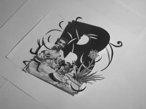
B is for Bitter Aloes
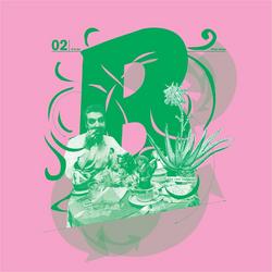
Following from the last 'A' I wanted to begin the next letterforms. I threw the dice again to get this entry, 'Bitter Aloes'. Conceptually this was quite a lucky roll . . . bitter aloes is basically the dried sap of an aloe plant and has been used for a long time as a drug to aid digestion. It is euphemistically described as a digestive stimulant, it is of course a 'purgative' ń a potent laxative!
So this is about digestion. It fits well with things I've been thinking about in relation to appropriation and nostalgia, mainly the consumption and transformation of existing styles, images, and symbols. This is what Elvis did, and what he's doing here ń cannibalising Little Richard, Chuck Berry, Hank Williams, and Bill Monroe.
I've approached this is the same way as the previous 'A', beginning with a hybrid letterform. The 'B' is a hybrid made from the Burger King logotype and a set of decorative capitals from the early 20th century with plant like forms intertwining through the letterforms.
I'm having real trouble with colour!? Maybe I'm just being indecisive? As I mentioned in the last post I was worried about these beginning to look too 'elegant' . . . and I had been looking for ugliness . . . or had I? Monsters? Anyhow I had thought I could try pushing colour around this problem a bit. I'm worried they could end up looking like a kiddie's introduction to the alphabet if they all follow this model though!? I guess that's a point though ń the cushions don't all need to be a similar range of colours.
I'm going to try and get a couple of cushions made this week so I can get a better feel for what I'm dealing with, and also take them to Melbourne for the GRC next week . . . maybe the panel could fight each other with them . . .
Posted by Luke Wood at 06:34 PM
October 02, 2004
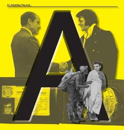
'A' revision again . . .
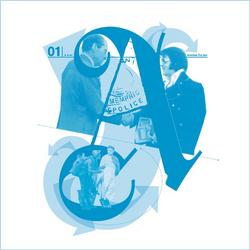
This image again responding to problems I had with previous images. Specifically the cut and paste, and the obvious layering of images. This one is an attempt to render the image more as a 'whole' ń disparate pieces grafted together to form a new hybrid image (that was the plan anyway!). I also wanted to try to relate the letterform more closely to the image . . .
To do so I thought it might be interesting to develop a hybrid letterform based on the two ideas or moments I was trying to connect. This letterform is a hybrid 'A' made up of a greek letter carved into stone, and a blackletter 'A' (Gotisch) . . . I was interested in both having formal/conceptual relationships to notions of justice and democracy . . . that the final form looks quite romantic and idealised I thought was appropriate.
Problems? This is hardly monstrous! It's hard to tell but I was thinking that the application to the cushion would create the monster . . . but now I'm not sure? I'd like to actually try making another letterform, 'B' I guess, so I can start to think about this as a series . . . as a 'piece' it is 26 cushions, it's quite hard to critique one on it's own, not knowing what's going to play out over the others? I'd like to try perhaps taking this back off the computer (print it out whole or in parts and reassemble it?).
Posted by Luke Wood at 11:23 AM
'A' revision . . .
This image responds to problems I discussed in the previous post. Mainly wanting to make the letterform more dominant. I'm concerned that I was beginning to lose the reference to the illustrated capital, and also I've been thinking about the possibilty of photographing the cushions and bringing them back into a 2D print medium afterwards . . . kinda' getting interested in how images are mediated and reciprocally transformed ń seems to have something to do with the process of hybridisation.
Posted by Luke Wood at 10:47 AM